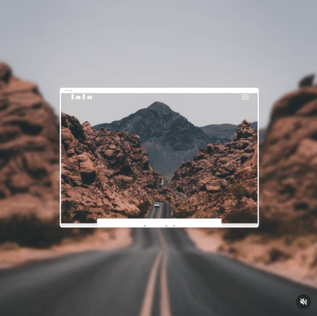
We all want our social media content to perform well—and the best way to stand out in the cluttered, visually overwhelming feed on your favorite digital platform is to have material that looks good.
That’s because, according to Facebook studies, somebody who is scrolling through on their phone is going to spend 1.7 seconds looking at whatever you post before they decide to keep on scrolling. One point seven seconds! Talk about a short time to make a big impression.
So whether you’re working with an advertising agency or simply putting together a graphic yourself that you can post to social, you need to prioritize those visual elements. If there’s a word or an image that’s important, make it stand out most prominently. And of course, make sure the overall finished product looks good!
The only problem is that “looks good” can be subjective. Maybe you’ve put something together that you think looks good, but because you aren’t looking at it with the informed critical eye of a professional graphic designer, you might not know how overstimulated social media scrollers will respond to it.
Here are 3 tips from our graphic design team that will help you design stand-out ads on your own:
1. Keep it simple
Yes, we know it’s tempting to go overboard with visual elements and lots of text. But this is a case where less is more. You want to keep your ads straightforward and to the point, both in terms of visual elements and text. Busy ads are rarely effective—never underestimate the power of white space. This gives your viewer’s eyes some breathing room and lets them focus on the elements you want them to notice.
As for text, keep it to a minimum. Save the long-winded copy for captions, headlines, and descriptions.
2. Consider your CTA
Ah, your call to action—known as your CTA for short. This is what you actually want your audience to do after they see your ad. And you want to make your CTA very, very clear. Being ambiguous or passive doesn’t work for ads. Give a short, sweet direction (one or two words is ideal) so that people know how to respond.
If you want them to sign up for a newsletter or make a purchase, say “Sign up” or “Register.” On the other hand, if you want traffic to your website or your online store, try using “Learn more” or “Shop now.”
3. The visual itself
Last but not least, be smart about the visual elements you choose. Even if your ad design is simple and straightforward, and even if your call to action is clear, your ad performance won’t peak unless you have a great image, motion graphic, or illustration that catches attention.
But what constitutes a good visual? Aim for an image or graphic that reflects your brand and/or target audience, and stay coherent with your branding. When your audience sees the same colors, fonts, and other graphic elements from you consistently, it creates brand recognition.
If you need photos, you can turn to free options online for stock photography, such as Unsplash and Pexels. And going bold with color is always a good choice—color makes your ad stand out against the digital landscape.
Now, some real talk: Creating your own designs might work in a pinch for the occasional social media post. But if you’re going to be making the investment in advertising, why wouldn’t you get a professional to handle it? We know we’d love to work with you!
If you’re interested in having our team of in-house specialists handle your ads, let’s book a discovery call.